Hey there! Welcome to PitchPages.io, the creators of the "PitchPage."

In the startup world, you may already be quite familiar with pitch decks. A pitch deck is a presentation that is used to pitch an idea, usually to an investor and in hopes to secure some startup funding. However, most investors typically spend less than 3 minutes reviewing your pitch deck, and that's even if they chose to download it or view it at all.
Investors receive hundreds of pitch decks every week, so it's crucial to put yourselves in their shoes before you go sending out your big email attachments and links to all your folders.
The Problem with Pitch Decks
Most Founders have this belief that they need to cram as much data and information as they possibly can into a massive pitch deck. What they don't realize is that investors only care about a couple of things. First and foremost they care about your team, and second to that they care about whether or not your idea makes sense and if the market is big enough to get them 100x ROI. However, most Founders fill up a 25 slide presentation with fluff. They feel like they need to try and explain everything. This is the wrong approach. Cut out the fluff, and tell investors only what they need to know. PitchPages removes the fluff.
What Amazon AWS had to say:
"PitchPages was a tremendous resource for the AWS US University Startup Competition. The standardized, clean, and easy-to-use template allowed founders and judges to focus on the actual content of the startup presentations and not design choices. I was impressed by how fast and easy it was to get started. - Jenny Wong, Startup Business Development at Amazon AWS
What the Collegiate Entrepreneurs' Organization had to say:
" If you’ve ever seen a Pitch Deck, you know how cumbrous they can be. Often jam-packed with flashy graphics, unnecessary information, and a lack of direct substance. PitchPages.io eliminates the fluff, helping a business present only the details that truly matter to the reviewer in an interactive, web based pitch deck. My organization hosts the nation’s largest collegiate entrepreneurship competition and we evaluate more than 450 ventures per year. We used PitchPages for our top 100 finalists and our students loved it. For the first time, they left a competition with something that they can use in the real world. We will continue to use PitchPages as the standardization of the Pitch Deck is invaluable to our program and selecting the best entrepreneur for funding. - James N. Zebrowski, Jr., M.S. – Executive Director, Collegiate Entrepreneurs’ Organization
PitchPages.io was created to solve our own problem
Fundraising is a very daunting process, and for newcomers it can seem almost like an impossible task. For us, we grew tired of sending email attachments and links to folders. We were tired of keeping track of who we were sending what to and what version of our deck was being shared.
It was through our own trial and error that we found that the absolute best way to share your pitch with an investor was to keep it as simple as possible. One link to one page with just the highlights, that is beautifully designed and easier for investors to review. This strategy and pitch format not only helped us raise money for past ventures, but it's already helped our current users raise almost $2 million in startup capital.
Build a beautiful PitchPage instantly without knowing code or design
Our software is completely plug and play. All you have to do is input your startup information into our PitchPage Wizard, and within minutes you'll have a fully functional landing page with your own dedicated URL that you can use to share your entire pitch and data room with any investor.
No code. No design skills required.
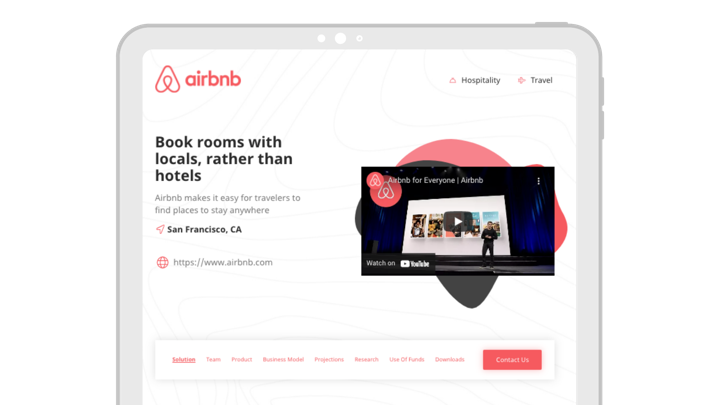
Here's a quick video that shows you how we took Airbnb's old pitch deck and converted it to a PitchPage instantly. Take a look and see for yourself!
A PitchPage is exactly what investors want to see when you send them your startup pitch
Everything that goes into a PitchPage has a purpose. When an investor visits your PitchPage for the first time, they'll know exactly what you do without having to figure it out.
ONE LINK: For starters, every PitchPage has it's own dedicated URL. This means that all an investor needs to do to access your pitch, your videos, and your data room, is to click your link to visit your PitchPage. For example, we converted Airbnb's pitch deck into a PitchPage, and here is the URL: https://airbnb.pitchpages.io/
EASY NAVIGATION: Our built-in interactive menu makes it easy for investors to navigate through your entire page. PitchPages has completely eliminated the need for your investor to have to click through slides. With our software, Founders can instantly build their pitch on scrolling page that does it all.
ACCESS TO DATA ROOM: Our built-in data room makes it easy for investors to request access to your additional investor materials. These materials might include your cap table, 3-5 year projections, market research, patents, or any other information that would be important for your investor to complete their due diligence. You can even include your fully detailed extended pitch deck, in case you're having trouble parting ways.
It's time to #PitchBetter!
We would love to give you a personal demo of our software. Whether you're a current Founder, or even just a startup enthusiast, we're proud of what we have built and are excited to share it with the global startup ecosystem.
Contact Andrew or Tyler at info@pitchpages.io and let's all #PitchBetter!
